Which means this time we start off with 5 of the god damned ugliest flags America has ever created.
#5
 |
| The State of Idaho. The State of Idaho. |
To be honest, this actually isnt a bad flag.....especially if you are suffering from chronic short term memory loss and forget what state you were in in the 1/2 inch it took to move down to the next part of the flag.
I assume the explanation here is that Idaho took the whole "so nice they named it twice" thing and said "well shit if it works for new york..." either that or they are real serious about the state motto Esto perpetua (Let it be perpetual)
#4
.svg/900px-Flag_of_Nevada_(1905-1915).svg.png) |
| The flag of Nevada (original) |
On the upside, its a good thing this flag was designed before Las Vegas really took off, Otherwise the word Nevada would likely be stuck between the words "MONEY" and "SEX" and the stars replaced by pictures of famous hookers.
#3
 |
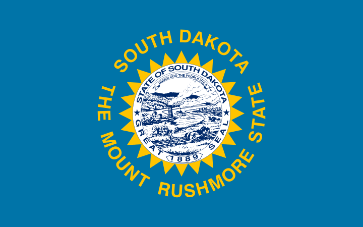
| The State of South Dakota. |
So what happens when you combine the short term memory loss issues of Idaho with the need to openly justify our existence/reason any one would ever come here issues of Nevada?
You get this monstrosity. Oh and by the way, those yellow triangles? well before Mt Rushmore existed South Dakota was called the "Sunshine State" so thats what it put on the flag. And instead of the seal in the center, they had a yellow sun. They just apparently forgot to remove the suns rays when they removed the rest of it.....oops.
But hey in all fairness it could have been worse, they could have actually included an image of Mt Rushmore in the center. Oh shit, I probably just accidentally designed their new flag for them
#2
 |
| The flag of retired folks everywhere....I mean Florida. |
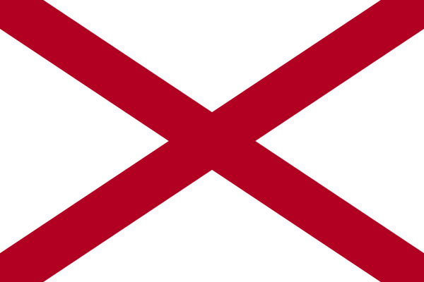
So people might wonder how it is that Florida makes this list and Alabama doesnt. See Alabama's flag looks exactly the same as Florida's except without the seal in the center. But the saving grace of Alabama in this case is that, as lazy as that design is, they did it first.
 |
| Alabama |
Which means that, much like Modern republicans and Obamacare, even given half a decade the brain trust in Florida couldn't come up with a flag of any kind....so they finally settled basically stealing the original idea (Alabama) and claiming it was actually something different.
I image the decision to add the someone said "what if we slapped our state seal on it? then it would look like a totally original and uniquely Floridian idea, and no one will ever notice we stole the whole thing from someone else?" "GENIUS!"
#1
 |
| Hawaii State Flag |
So if you chugged cans of red white and blue paint until you threw up, this is what I imagine the end result would look like.
Its actually amazing to me how bad this flag looks, given how close it is to the original american flags, which didnt look nearly this bad. Its all due to the two blue stripes (apparently there is actually a reason all the red white and blue flags of the world dont put the red and blue sections together) and the canton (the upper left corner) being placed on a red stripe, giving the image of the bottom of the union jack running into that stripe and moving across the flag.
Plus the fact that this thing literally had nothing but lines in every direction means there is way to damn much going on in the flag, and at the edge of the canton the cross of the union jack and the red and blue stripes it runs into looks like graphical tearing on a computer when the image display cant keep up with the lines moving.
And that concludes the top 5 ugliest flags of the United States.....BUT not this blog as its now time for the bonus round:
This are flags that are still bad, but for various reasons I didnt want to include above:
Ladies and Gentlemen the state flag of Georgia:
| The new flag of Georgia (since 2003) |
So even before the controversy in South Carolina, the state of Mississippi gets a lot of crap (and justifiably so) for having the confederate flag in their state flag. Georgia used to get the same kind of crap, until 2003 when they removed the confederate flag from their flag and replaced the flag with the above one, to widespread acclaim.
.svg/900px-Flag_of_the_State_of_Georgia_(1956-2001).svg.png) |
| Georgia flag before 2003 |
And to be honest, its not a bad flag. in fact its a very good design in my opinion.,......except for one small problem. The flag everyone thinks about when I say "confederate flag" the one on the flag of mississippi, the one that was flying in south carolina, the one that had been on the Georgia flag, isnt the real confederate flag. Its the flag of Robert E. Lee's Army of Northern Virginia.
So what did the real confederate flag look like? Glad you asked it looked like this:
Look familiar? thats right its now the official flag of Georgia (with the seal added). Although I guess at some level you got to give Georgia credit for ballsiest move ever, given that they removed a confederate battle flag from their flag, replaced it with the ACTUAL confederate flag, and did it in such a way that they actually got praised for it,
Still if you didnt like the implications of the pre 2003 design, you really should have an even bigger problem with this one.....just saying.
Finally one last flag, This just missed being on the list by virtue of being impossible to find a good image of so I felt it was a bit unfair to hold it to the same standard:
 |
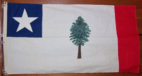
| The confederate era flag of Mississippi |
Look say what you will about the current Mississippi flag, but at least it looks like a flag...a racist flag, but still a damn flag.
This thing looks like something a preschooler would draw. "so why is there a tree?" "cause I like trees" "Ok well what about the blue star" "I like blue stars" "well dont you want to color in the rest of it red?" "no I'm bored...can I play with legos?"
Even cutting that thing some slack for being made of cloth and not a more modern image(unlike the other pictures I'm using...couldnt do that for this flag the all white disappered into the background) this is still an amateur hour flag. Even if you hate the current flag.....at least now you understand why they felt the need to change it.....
.svg/810px-Flag_of_the_Confederate_States_of_America_(1861-1863).svg.png)
There was a Magnolia Flag at the Old Spanish Fort, in Pascagoula a couple of decades ago, that was genuine and really impressive. No red border, a mature tree in full flower. I hope it's still there.
ReplyDelete